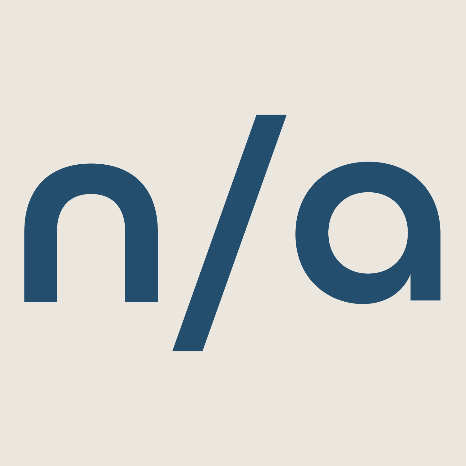
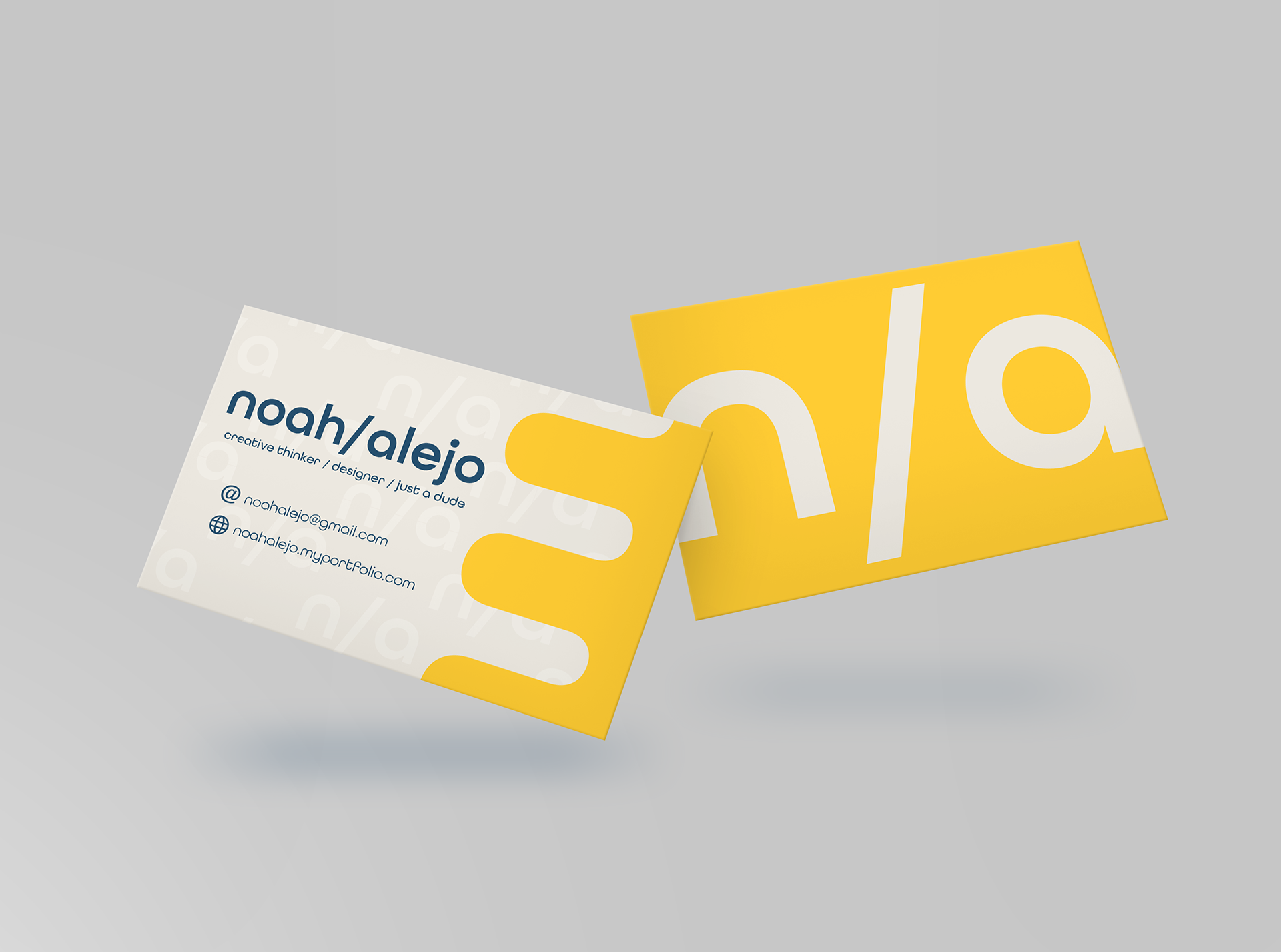
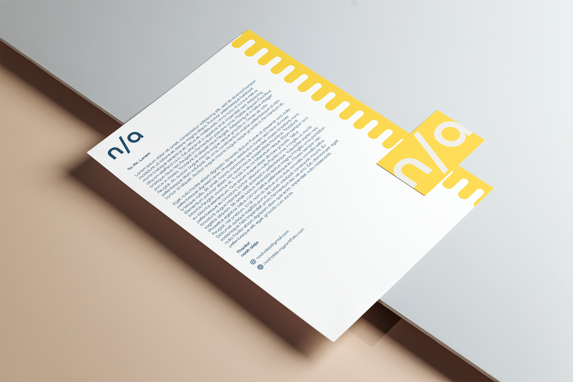
When presented with the task of self-branding, I seized the opportunity to craft a brand that not only represented me but also my personal style. As a designer, I usually prefer clean, minimal designs. I knew when branding myself that I wanted to create something that embraced this and also something that infused some of my personality into it. That's when I turned to my initials - "na".
Initially, I struggled with the other meanings associated with the abbreviation "n/a" or "not applicable". However, as an introverted designer with a unique sense of humor, I realized that I could play with this connection and turn it into a creative opportunity. I chose to embrace the association by creating a visually intriguing logo that played with the letters in my initials and emphasized the "n" and "a" in a unique way.
Throughout the branding process, I remained committed to creating a clean and minimal aesthetic that would be memorable and visually striking. By incorporating my style and infusing it with my sense of humor, I was able to create a brand that accurately represents who I am as a designer.
